Non-for profit WRD Challenge
Overview
I recently worked within a design team, where we were tasked with finding a local non-for profit website, for a three week design challenge as part of a UX bootcamp course.
The non-for profit organisation we have chosen is the “Tradies for the bushfire rebuild”. With all of our team members having witnessed the destruction of the Australian bushfires over recent years, we know that the aftermath brings hardship to those affected and the process to rebuild their lives is costly and time consuming.
We felt a connection to this cause, because we believe that this service provides a great value to the community. It focuses on connecting skilled volunteer tradespeople with people who need to rebuild their properties after the bushfires.
Here I will take you through our teams design process from the initial research/analysis to the final completed prototype.

Research
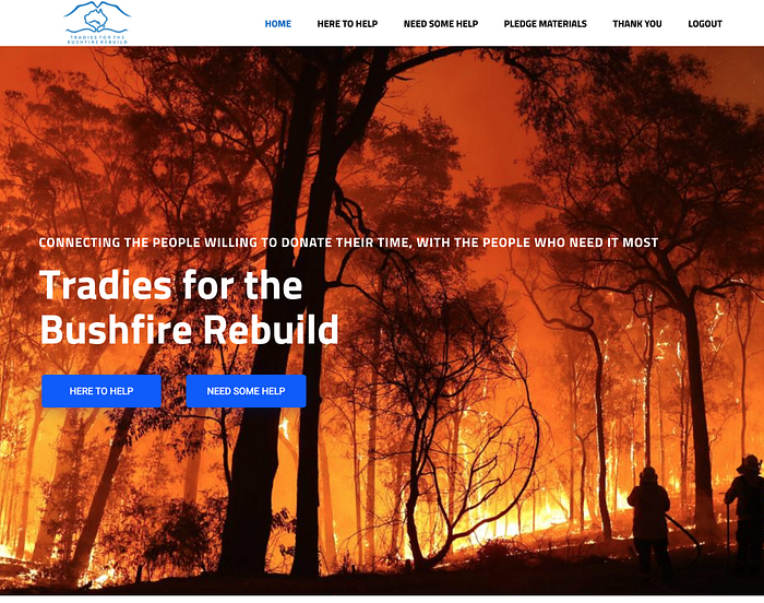
Our research began by running an evaluation of the current site, this allowed us to fully scope the functionality and purpose behind the non-for profit. Once we had identified the sites value and how to achieve the main functions, we were able to devise our research plan as a way to gain an understanding of how people go about donating to charity, uncover any insights as to the paths people take to get involved in volunteer opportunities and discover how well the current site functions when put to the test.

Due to current covid restrictions, the research was conducted using three different methods to allow us to collect both quantitative and qualitative data.
The quantitate data was collected through the online survey and the user testing conducted on tasks based on the current site. Focusing on participants feelings around forms, donating to charities and volunteering labour skills.
Whilst the Qualitative data was collected during the face to face semi-structured interviews. This is where we gained some our most valuable insights, as all users had great feedback in regards to the functionality of the site but also its professionalism.

Definition/Ideation:
Having collected all of our data, we felt it was best to synthesize the data into an Affinity map which would allow us to analyze our interview notes and find common themes across the user research. During this process we were able to identify common pain points and observations users experienced during the testing of the site.

Through research and brainstorming, we could now define the problem to which we could focus on solving.
THE PROBLEM:
Tradies for the bushfire rebuild was designed to help connect registered tradies who want to help with communities and people affected by the most recent bushfires. We have observed the manual multistep process to create an account and register to request a services results in long wait times for fire affected communities, unable to access the help they need.
THE SOLUTION
Enhance the user experience and inspire more volunteers to want to get involved, by redesigning the current website layout, creating a menu section and consolidate the registration form process.
PERSONA:
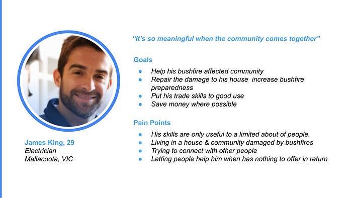
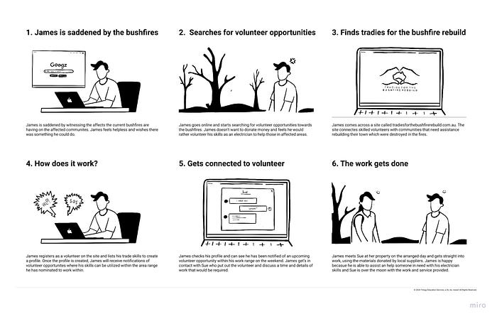
Now that we understood James’s characteristics and intentions, we developed a story board to help us map out James’s journey from his initial desire to help out through to James being on site lending his skills to assist in a rebuild project. The storyboard was integral to our ideation process, as we could then prioritise the features and layout of the website based on what was most important to assisting James in achieving his goal.
Wireframes
Approaching the wireframe stage, we knew the key features and task flows that a user would require in order to register as a volunteer, register for help or donate towards the organisation.
With these key features in mind it was imperative during our sketching to have access to these tasks front and centre in the the Primary menu. Giving users clear visibility of the sites main functions.
we really focused on the header navigation bar. Because we don’t have many functions we wanted everything to be easily accessible and from our initial website testing the header navigation was always the first option for users when searching for the information they needed.


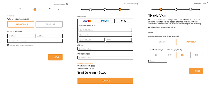
The donation process was originally set up to be its own page, From there the users could choose how they wanted to donate, select their option and complete the pop up donation form. We also decided to include a donation counter which was to give the user visual feedback of the current total raised and total number of donor’s.
The thought process behind the donation form design, was to keep it quick and simple so not to deter users from their initial intention to donate. The painful task of completing long registrations forms, was a common insights discovered in our user research.
Wireframe testing:
Before going on to finalising our design and adding UI elements to the wireframe, we wanted to test the current usability mapping. We focused on 3 objectives:
- The navigation menu
- The donation process
- Home page layout

The user testing on the wireframes provided mixed with results, with users finding common issues with:
- The donation process — Doesn’t seem legit and there is no where to enter how much someone wishes to donate.
- Primary navigation felt pointless having a drop down menu for only two options
With these results, the team discussed possible solutions and decided to simplify the navigation system so that users are taken directly to the page. This meant we could remove the secondary drop down menu, which you will see below in the final designs.
DESIGN:
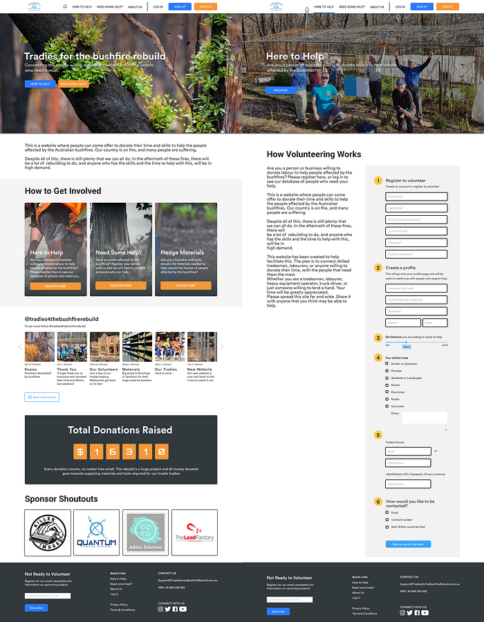
In our initial user tests one point that came up several times was the powerful images, however they were quite somber images, images of bushfire destruction and struggling communities. We wanted to keep the imagery striking but also keep the mood lighter and more hopeful, looking at how we could help people and not reminding them of the terrible experience of the bushfires. This was also how we chose our colour palette, the blue we decided to keep from the original website and we added the orange as together they stood out, which was important for button visibility, but they helped to keep the mood of the website bright.

High fidelity Design:
Usability testing:
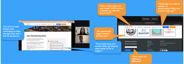
With our design complete we undertook more user testing and the main feedback was around
a) navigation
· having multiple ways to get to the home page
· having sign up & log in on the header navigation
b) around the forms
· while they were broken up into sections they were still quite long
· some of the section labels were confusing to users
Iterations/Final Design:
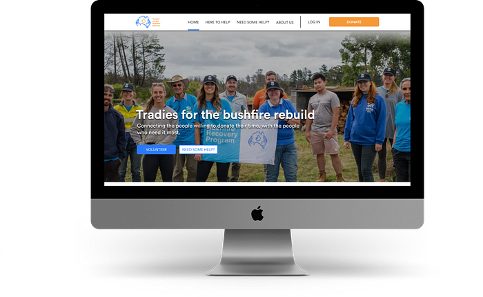
With all of that in mind we made more changes; as you can see here with the header navigation, (log in & home) and made the forms a multi-step process with limited inputs in each section which has the best results with user testing.


Here is our clickable prototype:
Conclusion:
As previewed in our final designs and prototype, our focus was to streamline the application process and create an efficient volunteering system that can be accessed by many. We also implemented a donation feature for users who want to assist but can’t offer their time
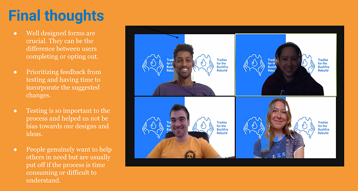
In conclusion we feel as though we have achieved our goal and that will hopefully be represented by the increase in volunteer registrations and also donations made to the organisation. Our next steps would be to design the next process and focus on connecting volunteers to upcoming opportunities once registered.
